Round Time Trend Graph

Contents
Over time, the data captured by mPace Manager can be displayed as a trend.
Since each teeblock (e.g. four per day) has a separate and distinct performance characteristic, each one can be used to represent a maximum round time and an average round time for the teeblock.
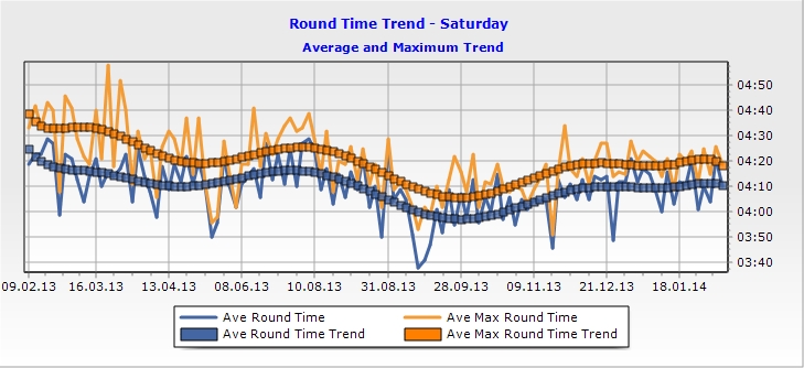
The chart above depicts the trend in round time over a year. The straight lines are real, observed, adjusted round times while the trend line is a polynomial line of best fit across the observed data points.
The trend graph is selectable by event day (e.g. Sat, Mon etc) and also recognises the difference between stroke events and par/stableford event types. A separate trend is displayed for stroke event history.